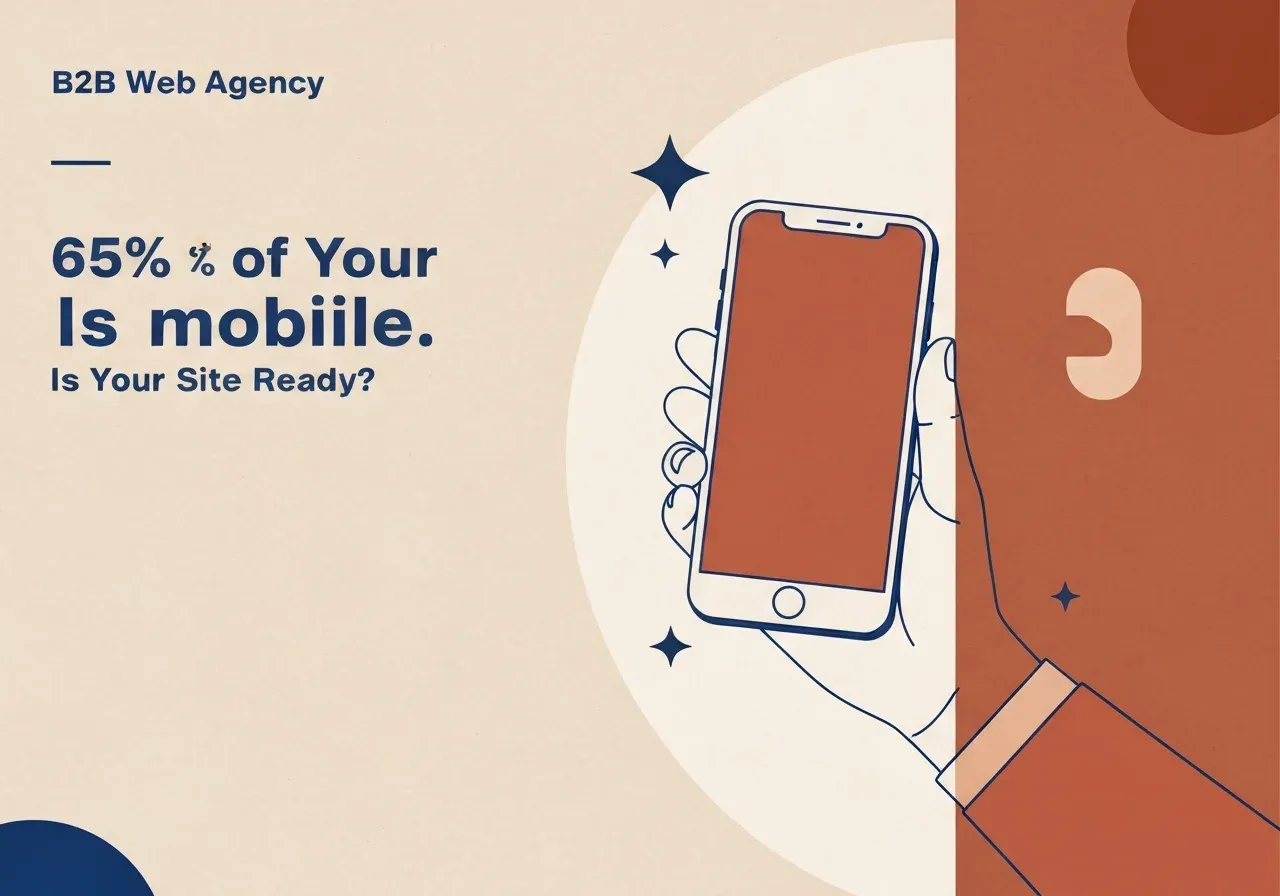
Statista’s 2024 data shows that 65% of web traffic in Europe comes from mobile devices. The Baltic and Nordic markets look similar. So roughly every second or third visitor on your site is holding a phone.
Yet many B2B and retail sites are still designed mainly for a desktop: layouts, buttons and forms built for a mouse click rather than a thumb. The result is simple. People leave.
What Google does with pages that are not mobile-friendly
Google uses mobile-first indexing: it evaluates your page as it appears on a phone, not on a desktop. A slow or incomplete mobile version affects your search positions even if the desktop version is excellent.
Three ways a mobile site is “broken”
1. It is slow. Mobile networks have higher latency than fixed broadband. A page that loads in two seconds on a laptop can take six to eight on a phone. Google’s research found that 53% of mobile visits are abandoned when a page takes longer than three seconds.
2. Navigation and layout are awkward. Text you cannot read without zooming. Buttons so close together that a thumb hits the wrong one. Horizontal scrolling because one element is wider than the screen.
3. Functions fail. A form that misbehaves in iOS Safari. A map you cannot close. A dropdown covered by another element. These rarely show up in desktop testing, so they can live on a site for years.
The mistakes we see most often
- Small text. 12–13 px looks fine on a desktop and is unreadable on a phone. Use at least 16 px for body text.
- Tap targets too small or too close. Apple’s Human Interface Guidelines set 44×44 px as the minimum tap area.
- Long forms. Ten fields look normal on a desktop and like paperwork on a phone. Ask for four or five and collect the rest later.
- Images at the wrong size. Full-size images scaled down with CSS slow the page and waste mobile data.
- Hover-only interactions. They do not exist on a touchscreen.
How to check your site in five minutes
Google PageSpeed Insights. Enter your URL and choose the Mobile view. Above 90 is good; below 50 is a serious problem. The report names specific fixes: unused CSS, image sizes, third-party scripts.
A real phone. The simplest test. Open the site, press every button, fill in the form, find the contact details. If it is awkward for you, it is awkward for a prospective customer.
Google Search Console. The mobile usability report lists pages with detected problems on your own domain.
How we build: mobile-first
We start design and code from the smallest screen, then adapt upwards. In practice:
- The design is approved on mobile first, then on desktop.
- Font sizes, button sizes and spacing are defined for mobile.
- Images are served at the right size for each device with responsive
srcset. - Forms are tested in iOS Safari and Android Chrome, not only on a desktop.
- Load time is tested on realistic 3G/4G connections, not only fast Wi-Fi.
If your site was built before 2019 and has not been reviewed since, it very likely has mobile problems. If it runs on WordPress, our note on when to replace WordPress covers the options.
Ask for a mobile audit
We run mobile audits for websites: PageSpeed analysis, a visual check, Core Web Vitals and form testing. You receive a prioritised list of concrete problems, not general advice. If you then continue with us, good. If not, the list is yours and any developer can work from it.